import emcee
import matplotlib.pyplot as plt
import numpy as np
import pandas as pd
import seaborn as sns
from IPython.display import HTML
from matplotlib.ticker import FuncFormatter
from scipy.optimize import minimize

%config InlineBackend.figure_formats = ['svg']
%config InlineBackend.print_figure_kwargs = {"bbox_inches": "tight", "metadata": {"Date": None}}MCMC for a logistic fit from early data: the notebook
This is the notebook behind MCMC for a logistic fit from early data, which in turn follows Fisher information for a logistic fit from early data. The post shows the figures and says what they mean. This notebook is the methodology: what is simulated, what is fitted, how the sampler is set up and checked, and where the numbers quoted in the post come from. It is meant to be read top to bottom.
To re-run it, pixi run notebook in src/link/logistic_mcmc/ of the blog’s repository. It takes about a minute. Every random number is seeded, so a re-run reproduces this page exactly.
In [1]:
Figures are SVG in the site’s body font, TeX Gyre Schola. matplotlib’s default svg.fonttype = "path" turns text into outlines, so a reader does not need the font installed. Anything with thousands of marks is drawn with rasterized=True, which keeps the axes and text vector but the file small.
In [2]:
INK = "#333333"
MUTED = "#777777"
GRID = "#e6e6e6"
# One colour per cutoff in the figures that show three cutoffs: blue, orange, green, in that order everywhere.
COLOURS = ["#2a78d6", "#eb6834", "#1baf7a"]
POSTERIOR = "#2a78d6"

plt.rcParams.update({
    "font.family": "serif",
    "font.serif": ["TeX Gyre Schola", "DejaVu Serif"],
    "mathtext.fontset": "stix",
    "font.size": 10,
    "text.color": INK,
    "axes.labelcolor": INK,
    "axes.edgecolor": MUTED,
    "axes.linewidth": 0.6,
    "xtick.color": MUTED,
    "ytick.color": MUTED,
    "xtick.labelcolor": INK,
    "ytick.labelcolor": INK,
    "xtick.direction": "out",
    "ytick.direction": "out",
    "axes.spines.top": False,
    "axes.spines.right": False,
    "axes.grid": True,
    "grid.color": GRID,
    "grid.linewidth": 0.5,
    "axes.axisbelow": True,
    "legend.frameon": False,
    "figure.facecolor": "white",
    "axes.facecolor": "white",
    "savefig.facecolor": "white",
    "svg.fonttype": "path",
    "svg.hashsalt": "logistic-mcmc",  # with Date: None above, a re-run gives byte-identical SVG
})
The model
Same model and notation as the previous post,
\[ y(t) = \frac{L}{1 + e^{-k(t - t_0)}} = \frac{L A e^{kt}}{L + A e^{kt}}, \qquad A = L e^{-k t_0}, \]
observed with multiplicative noise: we see \(\log y(t_i) + \epsilon_i\) with \(\epsilon_i \sim N(0, \sigma^2)\).
The parameters are \(\theta = (\log A, k, \log L)\) rather than Cook’s \((L, k, t_0)\), because they split into what early data can pin down, \(A\) and \(k\) (the exponential \(A e^{kt}\) that the left tail looks like), and what they cannot, \(L\). The inflection point is then derived, \(t_0 = (\log L - \log A) / k\). Logs are used for \(A\) and \(L\) because both are scales, and because the uncertainty on \(L\) turns out to span decades.
In these parameters
\[ \log y = \log L - \log\left(1 + \frac{L}{A} e^{-kt}\right), \]
and the second term is a softplus, np.logaddexp(0, x), which stays accurate for any \(t\). That matters: as \(L \to \infty\) at fixed \(A\) and \(k\) the curve becomes exactly the exponential, and the code should be able to evaluate that limit without overflowing.
In [3]:
def log_y(t, log_a, k, log_l):
    """log y(t) in the (log A, k, log L) parametrization, stable for any t and any L."""
    return log_l - np.logaddexp(0.0, log_l - log_a - k * t)
The simulated data
Units are chosen so that \(L = 1\), \(k = 1\) and \(t_0 = 0\). That is no loss of generality: it is the same as measuring \(y\) as a fraction of its limit and time in \(e\)-folding times from the inflection point. The noise is 10%, \(\sigma = 0.1\), and there are \(\rho = 10\) observations per \(e\)-folding time, starting at \(t = -10\), where \(y/L \approx 5 \times 10^{-5}\) and the curve is exponential to any precision the noise could see.
One noise realization is drawn and then cut off at successive times \(T\), as if watching the data come in. The cutoffs are named by how far up to the limit the data have reached, \(y(T)/L\), which is the quantity the Fisher information in the previous post depends on.
In [4]:
L_TRUE, K_TRUE, T0_TRUE = 1.0, 1.0, 0.0
LOG_A_TRUE = np.log(L_TRUE) - K_TRUE * T0_TRUE
THETA_TRUE = np.array([LOG_A_TRUE, K_TRUE, np.log(L_TRUE)])
SIGMA, RHO, T_START = 0.1, 10.0, -10.0

REACHED = np.array([0.01, 0.02, 0.05, 0.1, 0.2, 0.5, 0.8])
T_CUT = T0_TRUE + np.log(REACHED / (1 - REACHED)) / K_TRUE
SHOWN = [0.01, 0.1, 0.5]  # the three cutoffs drawn in the bands and pair figures

rng = np.random.default_rng(20260926)
t_all = np.arange(T_START, T_CUT.max() + 1e-9, 1 / RHO)
obs_all = log_y(t_all, *THETA_TRUE) + rng.normal(0.0, SIGMA, t_all.size)


def data_up_to(T):
    keep = t_all <= T
    return t_all[keep], obs_all[keep]


pd.DataFrame({
    "y(T)/L": [f"{u:.0%}" for u in REACHED],
    "T": T_CUT.round(2),
    "observations": [(t_all <= T).sum() for T in T_CUT],
}).set_index("y(T)/L")| T | observations | |
|---|---|---|
| y(T)/L | ||
| 1% | -4.60 | 55 |
| 2% | -3.89 | 62 |
| 5% | -2.94 | 71 |
| 10% | -2.20 | 79 |
| 20% | -1.39 | 87 |
| 50% | 0.00 | 101 |
| 80% | 1.39 | 114 |
The likelihood
With Gaussian noise in \(\log y\) and \(\sigma\) known, as in the Fisher information calculation, the log-likelihood is a sum of squares,
\[ \log \mathcal{L}(\theta) = -\frac{1}{2\sigma^2} \sum_i \left( \log y_i^{\text{obs}} - \log y(t_i; \theta) \right)^2 + \text{const}. \]
Everything below, the maximum-likelihood fit, the profile likelihood and the posterior, is built on this one function.
In [5]:
def neg_log_like(theta, t, obs):
    log_a, k, log_l = theta
    r = obs - log_y(t, log_a, k, log_l)
    return 0.5 * np.sum(r * r) / SIGMA**2
Maximum likelihood and the profile likelihood
The key fact about this likelihood is what happens as \(L \to \infty\) with \(A\) and \(k\) held fixed: the logistic becomes the exponential \(A e^{kt}\), so the likelihood tends to a constant, the likelihood of the best exponential fit. It does not go to zero. If the data cannot tell a logistic from an exponential, the exponential can even be the best fit, and then the maximum-likelihood estimate (MLE) of \(L\) is infinite.
The clean way to see this is the profile likelihood of \(\log L\): fix \(\log L\), maximize over the other two parameters, and plot the result against \(\log L\). Plotted as \(-2 \Delta \log \mathcal{L} = 2 \left( \min_{A,k} (-\log \mathcal{L}) - \min_\theta (-\log \mathcal{L}) \right)\), its minimum is at the MLE, and by Wilks’ theorem the set where it is below \(\chi^2_{1, 0.95} = 3.84\) is an approximate 95% confidence interval. No prior is involved anywhere.
The profile is computed on a grid in \(\log L\) out to \(e^{20}\), far past anything physical, so that the plateau to the exponential is visible. Each grid point is a two-parameter Nelder–Mead fit, warm-started from its neighbour; the grid is swept in both directions and the better fit kept, which guards against a warm start getting stuck.
The same is done for \(t_0\), with \(\log L = \log A + k t_0\) substituted, since \(t_0\) is not one of the sampled parameters and its profile has to be computed on its own.
In [6]:
LOG_L_GRID = np.arange(-5.0, 20.0 + 1e-9, 0.05)
T0_GRID = np.arange(-8.0, 25.0 + 1e-9, 0.05)
NM = {"xatol": 1e-9, "fatol": 1e-11, "maxiter": 5_000}
CHI2_95 = 3.841


def profile(t, obs, grid, of="log_l"):
    """min over (log A, k) of -log L, at each value of log L (of="log_l") or t0 (of="t0")."""
    def theta(p, v):
        return (p[0], p[1], v) if of == "log_l" else (p[0], p[1], p[0] + p[1] * v)

    best = np.full(grid.size, np.inf)
    for order in (np.arange(grid.size), np.arange(grid.size)[::-1]):
        x = THETA_TRUE[:2]
        for i in order:
            fit = minimize(lambda p: neg_log_like(theta(p, grid[i]), t, obs), x, method="Nelder-Mead", options=NM)
            x = fit.x
            best[i] = min(best[i], fit.fun)
    return best


def mle_and_interval(grid, prof):
    """MLE and the 95% profile-likelihood interval, with np.inf where the profile never climbs back up."""
    d = 2 * (prof - prof.min())
    # On the plateau the profile is flat to optimizer precision, so "the minimum is at the far end of the grid"
    # has to allow for noise at the level of the tolerances.
    mle = np.inf if d[-1] < 1e-4 else grid[np.argmin(prof)]
    inside = np.flatnonzero(d <= CHI2_95)
    lo_i, hi_i = inside[0], inside[-1]
    lo = np.interp(CHI2_95, [d[lo_i], d[lo_i - 1]], [grid[lo_i], grid[lo_i - 1]]) if lo_i > 0 else -np.inf
    hi = np.interp(CHI2_95, [d[hi_i], d[hi_i + 1]], [grid[hi_i], grid[hi_i + 1]]) if hi_i < grid.size - 1 else np.inf
    return mle, lo, hi


profiles, profiles_t0, mle, mle_t0, profile_int, profile_int_t0 = {}, {}, {}, {}, {}, {}
for u, T in zip(REACHED, T_CUT):
    t, obs = data_up_to(T)
    profiles[u] = profile(t, obs, LOG_L_GRID)
    profiles_t0[u] = profile(t, obs, T0_GRID, of="t0")
    mle[u], *profile_int[u] = mle_and_interval(LOG_L_GRID, profiles[u])
    mle_t0[u], *profile_int_t0[u] = mle_and_interval(T0_GRID, profiles_t0[u])


def fmt(x):
    return "∞" if np.isinf(x) else f"{0 if abs(x) < 5e-4 else x:.3g}"


pd.DataFrame({
    "y(T)/L": [f"{u:.0%}" for u in REACHED],
    "MLE of L": [fmt(np.exp(mle[u])) for u in REACHED],
    "95% interval for L": [f"[{fmt(np.exp(profile_int[u][0]))}, {fmt(np.exp(profile_int[u][1]))}]" for u in REACHED],
    "−2Δ log-likelihood of the exponential": [
        f"{2 * (profiles[u][-1] - profiles[u].min()):.2f}" for u in REACHED],
}).set_index("y(T)/L")| MLE of L | 95% interval for L | −2Δ log-likelihood of the exponential | |
|---|---|---|---|
| y(T)/L | |||
| 1% | ∞ | [0.0563, ∞] | 0.00 |
| 2% | 0.577 | [0.0958, ∞] | 0.16 |
| 5% | 1.42 | [0.252, ∞] | 0.17 |
| 10% | 0.577 | [0.314, 3.33] | 5.62 |
| 20% | 1.22 | [0.681, 5.23] | 6.53 |
| 50% | 1 | [0.834, 1.23] | 117.27 |
| 80% | 1.11 | [0.987, 1.19] | 624.33 |
At 1% the profile never climbs back up: it is lowest on the plateau, so the best fit is the exponential and the MLE of \(L\) is infinite. At 2% and 5% the MLE is finite, but the exponential is only 0.2 worse in \(-2 \log \mathcal{L}\), far inside the 3.84 threshold, so the interval is still unbounded above. From 10% the exponential is ruled out, only just at 10%, and the interval closes.
The last column is the height of the plateau. It is worth keeping in mind for the posterior below: a plateau that is excluded at 95% can still hold a lot of posterior mass if it is long enough.
In [7]:
fig, ax = plt.subplots(figsize=(6.5, 3.8), layout="constrained")
palette = sns.color_palette("crest", len(REACHED))
for u, colour in zip(REACHED, palette):
    ax.plot(LOG_L_GRID / np.log(10), 2 * (profiles[u] - profiles[u].min()), color=colour, lw=1.6, label=f"{u:.0%}")
ax.axhline(CHI2_95, color=MUTED, lw=0.8, ls=":")
ax.text(8.6, CHI2_95 + 0.3, "95%", color=MUTED, fontsize=8, ha="right")
ax.axvline(0, color=INK, lw=0.6, ls="--")
ax.set_xlim(-1.6, 8.7)
ax.set_ylim(0, 15)
ax.xaxis.set_major_formatter(FuncFormatter(lambda v, _: f"$10^{{{v:g}}}$"))
ax.set_xlabel(r"$L$ (true value 1)")
ax.set_ylabel(r"$-2\,\Delta \log \mathcal{L}$, profiled over $A$, $k$")
ax.legend(title="data up to $y(T)/L$", fontsize=8, title_fontsize=8, loc="upper right", ncols=2)
plt.show()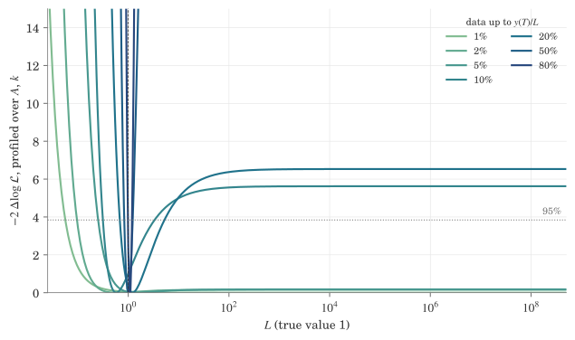
The prior and the posterior
The same plateau is why the posterior needs care. With a flat prior on \(\log L\) over the whole real line, the posterior density tends to a positive constant as \(\log L \to \infty\) and cannot be normalized. A sampler would simply walk off to infinity. So the prior on \(\log L\) has to stop somewhere, and here it is flat between \(e^{-7}\) and \(e^{7}\), about \(1/1000\) to \(1000\) times the true value. The priors on \(\log A\) and on \(k > 0\) are flat and wide enough never to matter.
The upper bound on \(L\) is not a technicality. Wherever the likelihood is on its plateau, the posterior mass there is proportional to the plateau’s height times its length, and the length is set by the prior. So:
- At 1–5%, where the plateau is as high as the peak, the posterior is spread up to the bound, and its upper quantiles are the bound’s.
- At 10–20% the plateau is excluded by the likelihood, but it is 14 units of \(\log L\) long, so it still holds a substantial share of the posterior. The credible interval reaches up into it even though the profile interval does not.
Move the bound and those upper ends move with it.
In [8]:
LOG_L_PRIOR = (-7.0, 7.0)


def log_posterior(theta, t, obs):
    log_a, k, log_l = theta
    if not (0.0 < k < 10.0 and LOG_L_PRIOR[0] < log_l < LOG_L_PRIOR[1] and -50.0 < log_a < 50.0):
        return -np.inf
    return -neg_log_like(theta, t, obs)
Sampling with emcee
The posterior is sampled with emcee, an ensemble sampler: 48 walkers move together, and each proposal for one walker is built from the positions of the others, so the sampler adapts to the scale and correlations of the posterior without tuning.
Choices, and why:
- Start. The walkers start in a tiny ball around the true parameters. That is the most favourable start possible, and it is deliberate: the question here is what the data allow, not whether a sampler can find the answer from a bad start.
- Burn-in. The first 2,000 of 12,000 steps are dropped. The walkers start bunched together, and those steps reflect the start, not the posterior. How long that takes is checked below with the autocorrelation time.
- Moves. emcee’s default is the stretch move. Here it is replaced by differential-evolution moves (
DEMove, with someDESnookerMove), because the posterior in \(\log L\) is a long flat plateau for the early cutoffs, which the stretch move explores slowly. That claim is checked below rather than taken on trust. - Thinning. The chain is thinned by half the autocorrelation time, which keeps the samples nearly independent and the arrays small.
In [9]:
N_WALKERS, N_STEPS, N_BURN = 48, 12_000, 2_000
DE_MOVES = [(emcee.moves.DEMove(), 0.8), (emcee.moves.DESnookerMove(), 0.2)]


def run_sampler(T, seed, moves=DE_MOVES):
    t, obs = data_up_to(T)
    p0 = THETA_TRUE + 1e-3 * np.random.default_rng(seed).normal(size=(N_WALKERS, 3))
    sampler = emcee.EnsembleSampler(N_WALKERS, 3, log_posterior, args=(t, obs), moves=moves)
    sampler.random_state = np.random.RandomState(seed).get_state()
    sampler.run_mcmc(p0, N_STEPS)
    return sampler


samples, taus = {}, {}
for i, (u, T) in enumerate(zip(REACHED, T_CUT)):
    sampler = run_sampler(T, seed=i)
    taus[u] = sampler.get_autocorr_time(discard=N_BURN, quiet=True)
    log_a, k, log_l = sampler.get_chain(discard=N_BURN, thin=max(1, int(taus[u].max() / 2)), flat=True).T
    samples[u] = pd.DataFrame({"log_a": log_a, "k": k, "log_l": log_l, "t0": (log_l - log_a) / k})

pd.DataFrame({
    "y(T)/L": [f"{u:.0%}" for u in REACHED],
    "autocorrelation time, steps": [taus[u].max().round(0) for u in REACHED],
    "burn-in / autocorrelation time": [(N_BURN / taus[u].max()).round(0) for u in REACHED],
    "effective samples": [(N_WALKERS * (N_STEPS - N_BURN) / taus[u].max()).round(-2) for u in REACHED],
}).set_index("y(T)/L")| autocorrelation time, steps | burn-in / autocorrelation time | effective samples | |
|---|---|---|---|
| y(T)/L | |||
| 1% | 16.0 | 125.0 | 29900.0 |
| 2% | 19.0 | 108.0 | 25800.0 |
| 5% | 16.0 | 126.0 | 30200.0 |
| 10% | 43.0 | 47.0 | 11200.0 |
| 20% | 44.0 | 46.0 | 10900.0 |
| 50% | 13.0 | 157.0 | 37600.0 |
| 80% | 13.0 | 153.0 | 36600.0 |
The autocorrelation time is the number of steps a walker takes to forget where it was. The usual rule of thumb is that the burn-in should be several of them and the chain at least 50; here the burn-in is at least 45 of them and the chain over 200, and every cutoff has more than ten thousand effective samples.
The comparison with the default stretch move, on the two cutoffs where the plateau matters most:
In [10]:
move_check = []
for u in (0.01, 0.1):
    T = T_CUT[REACHED == u][0]
    for name, moves in (("stretch (default)", None), ("differential evolution", DE_MOVES)):
        tau = run_sampler(T, seed=0, moves=moves).get_autocorr_time(discard=N_BURN, quiet=True)
        move_check.append({"y(T)/L": f"{u:.0%}", "moves": name, "autocorrelation time of log L": tau[2].round(0)})
pd.DataFrame(move_check).set_index(["y(T)/L", "moves"])| autocorrelation time of log L | ||
|---|---|---|
| y(T)/L | moves | |
| 1% | stretch (default) | 52.0 |
| differential evolution | 14.0 | |
| 10% | stretch (default) | 121.0 |
| differential evolution | 41.0 |
The stretch move would work, but it needs about three times as many steps for the same number of effective samples.
Which point estimate
Three candidates for “the” value of \(L\):
- Posterior median. Invariant under monotone reparametrization, but where the data are weak it is simply the middle of whatever prior range is left, and moves when the prior bound moves.
- MAP, the maximum of the posterior density. With flat priors in \((\log A, k, \log L)\) it is the MLE clipped to the prior box, so at 1% it lands on the bound. It also depends on the parametrization: a density in \(L\) is the density in \(\log L\) divided by \(L\), so the peak in one is not the peak in the other.
- MLE. Needs no prior and is invariant under reparametrization: the MLE of \(L\) is \(e\) to the MLE of \(\log L\), and \(t_0\) at the MLE is the MLE of \(t_0\).
There is no real prior information in this exercise, and a flat prior is not “no information” either (flat in \(\log L\), flat in \(L\) and flat in \(y(T)/L\) give different answers precisely where the data are weak). So the MLE is used as the point estimate, with the profile-likelihood interval that goes with it. The posterior is used for what it is good at, showing the whole shape.
For comparison:
In [11]:
pd.DataFrame({
    "y(T)/L": [f"{u:.0%}" for u in REACHED],
    "MLE": [fmt(np.exp(mle[u])) for u in REACHED],
    "MAP (MLE within the prior)": [fmt(np.exp(min(mle[u], LOG_L_PRIOR[1]))) for u in REACHED],
    "posterior median": [f"{np.exp(samples[u].log_l.median()):.3g}" for u in REACHED],
}).set_index("y(T)/L")| MLE | MAP (MLE within the prior) | posterior median | |
|---|---|---|---|
| y(T)/L | |||
| 1% | ∞ | 1.1e+03 | 11.4 |
| 2% | 0.577 | 0.577 | 11 |
| 5% | 1.42 | 1.42 | 17.5 |
| 10% | 0.577 | 0.577 | 0.838 |
| 20% | 1.22 | 1.22 | 1.54 |
| 50% | 1 | 1 | 1 |
| 80% | 1.11 | 1.11 | 1.08 |
At 1–5% the three disagree by orders of magnitude, which is itself the answer: no point estimate means much before the data reach about 10% of the limit.
For drawing, the MLE curve needs \(A\) and \(k\) too, from a full three-parameter fit started at the best grid point. At 1% the MLE is the exponential, which the parametrization handles by setting \(\log L\) very large.
In [12]:
mle_theta = {}
for u, T in zip(REACHED, T_CUT):
    t, obs = data_up_to(T)
    i = np.argmin(profiles[u])
    start = np.r_[THETA_TRUE[:2], LOG_L_GRID[i]]
    if np.isinf(mle[u]):
        fit = minimize(lambda p: neg_log_like((p[0], p[1], 50.0), t, obs), THETA_TRUE[:2], method="Nelder-Mead", options=NM)
        mle_theta[u] = np.r_[fit.x, 50.0]
    else:
        mle_theta[u] = minimize(neg_log_like, start, args=(t, obs), method="Nelder-Mead", options=NM).x
What the data allow
The MLE curve and the 50% and 95% posterior bands of \(y(t)\), for three cutoffs. The dots are the data, and everything right of the last one is extrapolation.
In [13]:
def bands(df, t):
    curves = np.exp(log_y(t[None, :], df.log_a.values[:, None], df.k.values[:, None], df.log_l.values[:, None]))
    return np.percentile(curves, [2.5, 25, 75, 97.5], axis=0)


t_plot = np.linspace(-8, 8, 400)
truth = np.exp(log_y(t_plot, *THETA_TRUE))

fig, axes = plt.subplots(1, 3, figsize=(9, 3.4), sharey=True, layout="constrained")
for ax, u, colour in zip(axes, SHOWN, COLOURS):
    T = T_CUT[REACHED == u][0]
    lo95, lo50, hi50, hi95 = bands(samples[u].sample(4000, random_state=0), t_plot)
    ax.fill_between(t_plot, lo95, hi95, color=colour, alpha=0.15, lw=0, label="95%")
    ax.fill_between(t_plot, lo50, hi50, color=colour, alpha=0.35, lw=0, label="50%")
    ax.plot(t_plot, np.exp(log_y(t_plot, *mle_theta[u])), color=colour, lw=1.5, label="MLE")
    ax.plot(t_plot, truth, color=INK, lw=0.8, ls="--", label="truth")
    t, obs = data_up_to(T)
    keep = t >= t_plot[0]
    ax.plot(t[keep], np.exp(obs[keep]), "o", ms=2.2, color=INK, alpha=0.7, mec="none", label="data")
    ax.axvline(T, color=MUTED, lw=0.6)
    ax.axhline(np.exp(LOG_L_PRIOR[1]), color=MUTED, lw=0.8, ls=":", label="prior bound on $L$")
    ax.set_yscale("log")
    ax.set_ylim(3e-4, 3e3)
    ax.set_xlim(t_plot[0], t_plot[-1])
    ax.set_title(f"data up to $y(T)/L$ = {u:.0%}", fontsize=10, loc="left")
    ax.set_xlabel(r"$k(t - t_0)$")
axes[0].set_ylabel(r"$y / L$")
axes[0].yaxis.set_major_formatter(FuncFormatter(lambda v, _: f"{v:g}"))
axes[-1].legend(loc="lower right", fontsize=8, handlelength=1.5)
plt.show()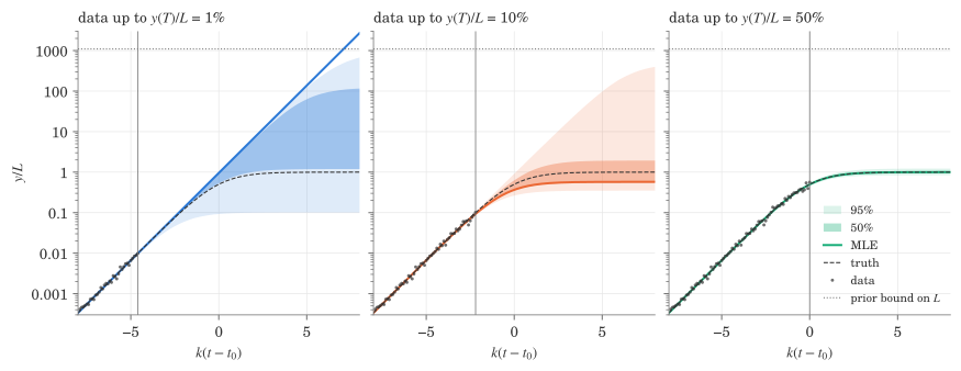
At 1% the MLE is the exponential itself and runs off the top. The posterior bands at 1% and 10% reach the prior bound, and at 50% they have closed around the truth.
The joint distribution
\(A\), \(k\), \(t_0\) and \(L\) against each other, for the same three cutoffs, with \(A\) and \(L\) on log axes. The dashed lines are the true values.
In [14]:
LABELS = {"log_a": r"$\log_{10} A$", "k": r"$k$", "t0": r"$t_0$", "log_l": r"$\log_{10} L$"}
TRUE = {"log_a": LOG_A_TRUE / np.log(10), "k": K_TRUE, "t0": T0_TRUE, "log_l": np.log10(L_TRUE)}

pair = pd.concat(
    [samples[u].sample(3000, random_state=0).assign(reached=f"{u:.0%}") for u in SHOWN],
    ignore_index=True,
)
pair["log_a"] /= np.log(10)
pair["log_l"] /= np.log(10)
pair = pair[list(LABELS) + ["reached"]]

g = sns.pairplot(
    pair, hue="reached", palette=COLOURS, corner=True, height=1.9,
    plot_kws={"s": 3, "alpha": 0.25, "linewidth": 0, "rasterized": True},
    diag_kind="hist",
)
# Each cutoff's histogram is redrawn scaled to its own peak: on a common density scale the 50% one is a spike
# that flattens the other two into the axis.
for ax, var in zip(g.diag_axes, LABELS):
    for artist in [*ax.patches, *ax.collections]:
        artist.remove()
    bins = np.linspace(pair[var].min(), pair[var].max(), 60)
    for (_, grp), colour in zip(pair.groupby("reached", sort=False), COLOURS):
        counts, edges = np.histogram(grp[var], bins=bins)
        ax.stairs(counts / counts.max(), edges, color=colour, fill=True, alpha=0.25, lw=0)
        ax.stairs(counts / counts.max(), edges, color=colour, lw=1.0)
    ax.set_ylim(0, 1.1)
    # The corner layout leaves the diagonal without a y label, so name each histogram in place.
    ax.set_title(LABELS[var], fontsize=10, loc="left", pad=2)
for i, row in enumerate(LABELS):
    for j, col in enumerate(LABELS):
        if j > i:
            continue
        ax = g.axes[i, j]
        ax.axvline(TRUE[col], color=INK, lw=0.6, ls="--")
        if i != j:
            ax.axhline(TRUE[row], color=INK, lw=0.6, ls="--")
    g.axes[-1, i].set_xlabel(LABELS[row])
    g.axes[i, 0].set_ylabel(LABELS[row])
g.axes[0, 0].set_ylabel("")
sns.move_legend(g, "upper right", bbox_to_anchor=(0.9, 0.9), title="data up to $y(T)/L$", frameon=False,
                markerscale=4)
for handle in g.legend.legend_handles:
    handle.set_alpha(1)
plt.show()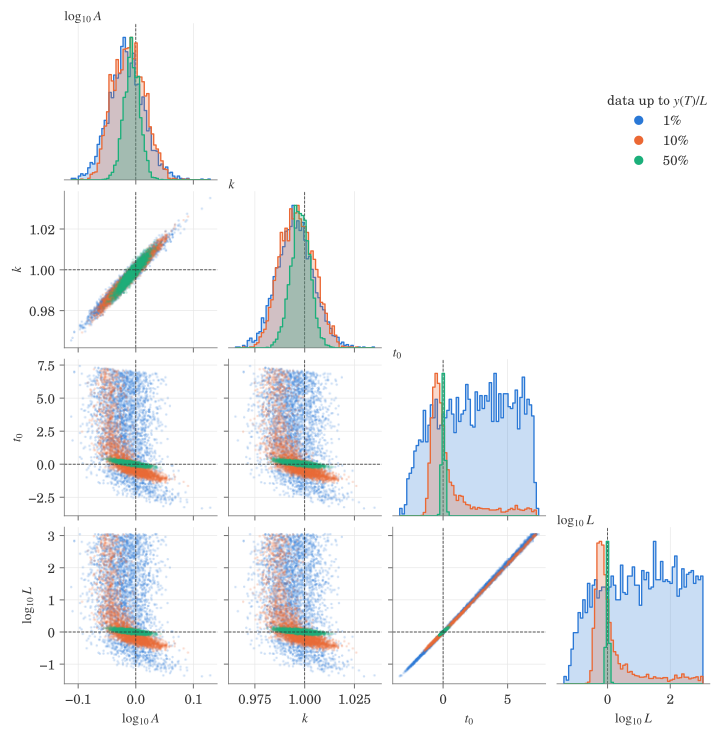
\(A\) and \(k\) are pinned down to a few percent even at 1%; they are strongly correlated with each other, which is the usual trade-off between the amplitude and the rate of an exponential fitted over a finite window. \(t_0\) and \(\log L\) lie on the line \(\log L = \log A + k t_0\), with a width set by how well \(A\) and \(k\) are known, so they carry the same information. At 1% the histogram of \(\log L\) is flat up to the prior bound, which is the prior showing through. At 10% the peak is near the truth but the tail runs to the bound, the plateau of the previous section.
The intervals, as the data come in
One figure for all seven cutoffs, for \(L\) and for how far ahead of the last observation the turning point is, \(t_0 - T\). The violins are the posterior, cut at its extremes. The black bars are the 95% profile-likelihood intervals and the dots the MLE; an arrow means the interval does not close, and an MLE at infinity is marked with ∞ at the top.
\(L\) is on a log axis, which is wide enough for the whole prior range, so nothing needs cropping. \(t_0 - T\) is on a linear axis, cropped at 12 \(e\)-folding times, and the few unbounded intervals are drawn as arrows.
In [15]:
labels = [f"{u:.0%}" for u in REACHED]
x = np.arange(REACHED.size)
T0_TOP = 12.0

fig, (ax_l, ax_t) = plt.subplots(1, 2, figsize=(7.6, 3.6), layout="constrained")

violin = {"inner": None, "cut": 0, "density_norm": "width", "width": 0.8, "linewidth": 0}
sns.violinplot(
    data=pd.concat([pd.DataFrame({"reached": lab, "v": samples[u].log_l / np.log(10)}) for u, lab in zip(REACHED, labels)]),
    x="reached", y="v", ax=ax_l, color=POSTERIOR, alpha=0.3, **violin,
)
sns.violinplot(
    data=pd.concat([pd.DataFrame({"reached": lab, "v": (samples[u].t0 - T).clip(upper=T0_TOP)})
                    for u, lab, T in zip(REACHED, labels, T_CUT)]),
    x="reached", y="v", ax=ax_t, color=POSTERIOR, alpha=0.3, **violin,
)

L_TOP = np.log10(np.exp(LOG_L_PRIOR[1])) + 0.45
for xi, u, T in zip(x, REACHED, T_CUT):
    # L, in log10 units
    lo, hi = np.array(profile_int[u]) / np.log(10)
    top = min(hi, L_TOP - 0.25)
    ax_l.plot([xi, xi], [lo, top], color=INK, lw=2, solid_capstyle="butt")
    if np.isinf(hi):
        ax_l.annotate("", xy=(xi, L_TOP - 0.05), xytext=(xi, top - 0.01),
                      arrowprops={"arrowstyle": "-|>", "color": INK, "lw": 2, "shrinkA": 0, "shrinkB": 0})
    if np.isinf(mle[u]):
        ax_l.text(xi, L_TOP + 0.05, "∞", ha="center", va="bottom", fontsize=11, color=INK)
    else:
        ax_l.plot(xi, mle[u] / np.log(10), "o", ms=6, color=INK, mec="white", mew=1.2, zorder=3)
    # t0 - T
    lo, hi = np.array(profile_int_t0[u]) - T
    top = min(hi, T0_TOP - 0.6)
    ax_t.plot([xi, xi], [lo, top], color=INK, lw=2, solid_capstyle="butt")
    if hi > T0_TOP - 0.6:
        ax_t.annotate("", xy=(xi, T0_TOP), xytext=(xi, top - 0.01),
                      arrowprops={"arrowstyle": "-|>", "color": INK, "lw": 2, "shrinkA": 0, "shrinkB": 0})
    if np.isinf(mle_t0[u]) or mle_t0[u] - T > T0_TOP:
        ax_t.text(xi, T0_TOP + 0.15, "∞" if np.isinf(mle_t0[u]) else f"{mle_t0[u] - T:.0f}",
                  ha="center", va="bottom", fontsize=11 if np.isinf(mle_t0[u]) else 8, color=INK)
    else:
        ax_t.plot(xi, mle_t0[u] - T, "o", ms=6, color=INK, mec="white", mew=1.2, zorder=3)
    ax_t.plot([xi - 0.4, xi + 0.4], [T0_TRUE - T] * 2, color=INK, lw=0.8, ls="--")

ax_l.axhline(0, color=INK, lw=0.8, ls="--")
ax_l.axhline(LOG_L_PRIOR[1] / np.log(10), color=MUTED, lw=0.8, ls=":")
ax_l.text(REACHED.size - 0.45, LOG_L_PRIOR[1] / np.log(10) + 0.06, "prior bound", color=MUTED, fontsize=8,
          ha="right", va="bottom")
ax_l.set_ylim(-1.6, L_TOP)
ax_l.yaxis.set_major_formatter(FuncFormatter(lambda v, _: f"{10 ** v:g}"))
ax_l.set_ylabel("limit $L$ (true value 1)")
ax_t.set_ylim(-2.5, T0_TOP)
ax_t.set_ylabel(r"turning point ahead of the data, $k(t_0 - T)$")
for ax in (ax_l, ax_t):
    ax.set_xlabel("data up to $y(T)/L$")
    ax.set_xlim(-0.6, REACHED.size - 0.4)
    ax.grid(axis="x", visible=False)
    for spine in ("top",):
        ax.spines[spine].set_visible(False)
plt.show()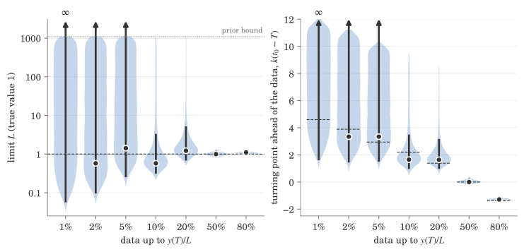
Reading left to right, as the data come in:
- Up to 5% the profile interval only has a lower end, and so does anything honest one can say about \(L\): the data rule out a limit close to where they are, because that would already show as bending, and nothing more. The MLE jumps around, and at 1% it is infinite.
- At 10% and 20% the profile interval closes, a few times the truth at the top. The posterior still stretches up to the prior bound, which is the plateau effect described above.
- From the inflection point on, everything agrees.
The right panel is the same thing in terms of the turning point, since \(t_0\) and \(\log L\) carry the same information once \(A\) and \(k\) are known.
Against the Fisher information
The previous post gave the Cramér–Rao bound on \(\log L\) with \(k\) and \(A\) known,
\[ \operatorname{sd}(\log \hat{L}) \gtrsim \left[ \frac{\rho}{k \sigma^2} \left( -\log\left(1 - \frac{y(T)}{L}\right) - \frac{y(T)}{L} \right) \right]^{-1/2} \approx \sigma \sqrt{\frac{2k}{\rho}} \, \frac{L}{y(T)}. \]
With all three fitted the bound comes from the full \(3 \times 3\) Fisher matrix. With \(u(t) = y(t)/L\) the derivatives of \(\log y\) are
\[ \frac{\partial \log y}{\partial \log A} = 1 - u, \qquad \frac{\partial \log y}{\partial k} = t (1 - u), \qquad \frac{\partial \log y}{\partial \log L} = u, \]
so \(I = J^\top J / \sigma^2\) with those as the columns of \(J\), and the bound is \(\sqrt{(I^{-1})_{\log L, \log L}}\). Both are evaluated at the true parameters. For the curves, the observation times end exactly at each \(T\), so the curve is not stepped by the sampling grid; for the table, they are the times actually used.
Two things from the simulation go against it: the posterior standard deviation of \(\log L\), and the half-width of the profile-likelihood interval divided by 1.96, which is what a standard deviation would be if the likelihood were Gaussian.
In [16]:
def fisher(t):
    """Fisher information for (log A, k, log L) at the true parameters, on observation times t."""
    u = np.exp(log_y(t, *THETA_TRUE)) / L_TRUE
    J = np.column_stack([1 - u, t * (1 - u), u])
    return J.T @ J / SIGMA**2


def cr_joint(t):
    return np.sqrt(np.linalg.inv(fisher(t))[2, 2])


def cr_known(t):
    return 1 / np.sqrt(fisher(t)[2, 2])


def times_up_to(T):
    return np.arange(T, T_START, -1 / RHO)[::-1]


def cr_known_closed(u):
    return 1 / np.sqrt(RHO / (K_TRUE * SIGMA**2) * (-np.log1p(-u) - u))


profile_sd = {u: (profile_int[u][1] - profile_int[u][0]) / (2 * 1.96) for u in REACHED}

summary = pd.DataFrame({
    "y(T)/L": [f"{u:.0%}" for u in REACHED],
    "CR, A and k known": [cr_known(data_up_to(T)[0]) for T in T_CUT],
    "CR, closed form": cr_known_closed(REACHED),
    "CR, joint": [cr_joint(data_up_to(T)[0]) for T in T_CUT],
    "profile half-width / 1.96": [profile_sd[u] for u in REACHED],
    "posterior sd": [samples[u].log_l.std() for u in REACHED],
}).set_index("y(T)/L")
summary.round(3)| CR, A and k known | CR, closed form | CR, joint | profile half-width / 1.96 | posterior sd | |
|---|---|---|---|---|---|
| y(T)/L | |||||
| 1% | 4.265 | 4.457 | 9.782 | inf | 2.692 |
| 2% | 2.133 | 2.221 | 4.423 | inf | 2.616 |
| 5% | 0.885 | 0.879 | 1.653 | inf | 2.321 |
| 10% | 0.414 | 0.432 | 0.714 | 0.603 | 1.831 |
| 20% | 0.202 | 0.208 | 0.323 | 0.520 | 1.289 |
| 50% | 0.070 | 0.072 | 0.097 | 0.098 | 0.097 |
| 80% | 0.036 | 0.035 | 0.044 | 0.047 | 0.046 |
- The closed form with \(A\) and \(k\) known is within 5% of the sum over the actual observation times.
- Fitting \(A\) and \(k\) jointly roughly doubles the bound, but it still goes as \(L / y(T)\), the divergence the previous post said remains.
- From the inflection point on, the posterior sd and the profile interval both agree with the joint bound.
- Before it they do not, and the reason is that neither the likelihood nor the posterior is anywhere near Gaussian there, while the bound is a local, Gaussian statement. At 10–20% the profile interval is lopsided, short below and long above, and the posterior adds the plateau on top, so its sd is 2.5–4 times the bound. At 1–5% the profile interval is unbounded, and the posterior sd drops below the bound, which an unbiased estimator could never do. That is the prior cutting the tail off: a flat prior of width 14 in \(\log L\) has an sd of \(14/\sqrt{12} \approx 4.0\), the most the posterior sd can be.
In [17]:
u_grid = np.logspace(-2.3, np.log10(0.9), 200)
T_grid = T0_TRUE + np.log(u_grid / (1 - u_grid)) / K_TRUE
PRIOR_SD = (LOG_L_PRIOR[1] - LOG_L_PRIOR[0]) / np.sqrt(12)

fig, ax = plt.subplots(figsize=(6, 4), layout="constrained")
ax.plot(u_grid, [cr_joint(times_up_to(T)) for T in T_grid], color=COLOURS[0], lw=1.8,
        label=r"Cramér–Rao, $A$, $k$, $L$ fitted")
ax.plot(u_grid, [cr_known(times_up_to(T)) for T in T_grid], color=COLOURS[1], lw=1.8,
        label=r"Cramér–Rao, $A$, $k$ known")
ax.plot(u_grid, SIGMA * np.sqrt(2 * K_TRUE / RHO) / u_grid, color=COLOURS[1], lw=0.9, ls=":",
        label=r"$\sigma \sqrt{2k/\rho}\; L / y(T)$")
ax.axhline(PRIOR_SD, color=MUTED, lw=0.8, ls="--")
ax.text(0.3, PRIOR_SD * 1.15, "flat prior on $\\log L$", color=MUTED, fontsize=8, ha="center")
ax.plot(REACHED, summary["posterior sd"], "o", ms=6, color=INK, mec="white", mew=1.2,
        label="MCMC posterior sd", zorder=3)
finite = np.isfinite(summary["profile half-width / 1.96"])
ax.plot(REACHED[finite], summary["profile half-width / 1.96"][finite], "D", ms=5, mfc="white", mec=INK, mew=1.2,
        label="profile interval half-width / 1.96", zorder=3)
for u in REACHED[~finite]:
    ax.annotate("", xy=(u, 28), xytext=(u, 14),
                arrowprops={"arrowstyle": "-|>", "color": INK, "lw": 1.2, "shrinkA": 0, "shrinkB": 0})
ax.set_xscale("log")
ax.set_yscale("log")
ax.set_ylim(top=30)
ax.set_xlabel(r"how far up the data have reached, $y(T)/L$")
ax.set_ylabel(r"spread of $\log L$")
ax.xaxis.set_major_formatter(FuncFormatter(lambda v, _: f"{v:.0%}"))
ax.yaxis.set_major_formatter(FuncFormatter(lambda v, _: f"{v:g}"))
ax.set_xlim(u_grid[0], u_grid[-1])
ax.legend(loc="lower left", fontsize=8)
plt.show()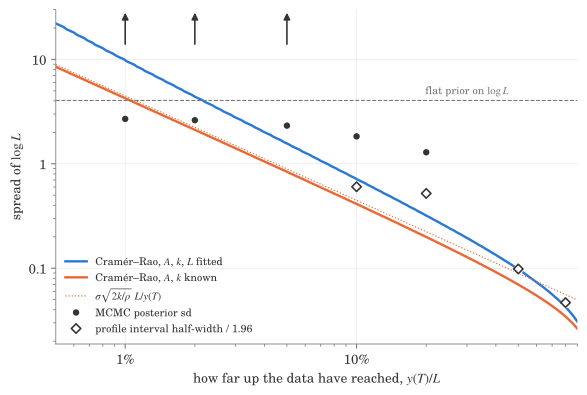
The arrows are the cutoffs where the profile interval is unbounded, so its “standard deviation” is infinite.
All the numbers
For reference, the intervals behind the interval figure, as MLE with 95% profile-likelihood interval, and posterior median with 95% equal-tailed credible interval. The truth is \(L = 1\) and \(t_0 = 0\). The last column is the posterior probability that \(L\) is above the top of the profile interval, which is the plateau effect in one number.
In [18]:
def ci(x):
    lo, mid, hi = np.percentile(x, [2.5, 50, 97.5])
    return f"{mid:.3g} [{lo:.3g}, {hi:.3g}]"


def pl(m, lo, hi, f=lambda v: v):
    return f"{fmt(f(m))} [{fmt(f(lo))}, {fmt(f(hi))}]"


numbers = pd.DataFrame({
    "y(T)/L": [f"{u:.0%}" for u in REACHED],
    "L, profile": [pl(mle[u], *profile_int[u], f=np.exp) for u in REACHED],
    "L, posterior": [ci(np.exp(samples[u].log_l)) for u in REACHED],
    "t₀ − T, profile": [pl(mle_t0[u] - T, profile_int_t0[u][0] - T, profile_int_t0[u][1] - T)
                        for u, T in zip(REACHED, T_CUT)],
    "t₀ − T, posterior": [ci(samples[u].t0 - T) for u, T in zip(REACHED, T_CUT)],
    "P(L > profile top)": [
        "—" if np.isinf(profile_int[u][1]) else f"{(samples[u].log_l > profile_int[u][1]).mean():.0%}"
        for u in REACHED],
}).style.hide(axis="index").set_uuid("numbers")
HTML(numbers.to_html())| y(T)/L | L, profile | L, posterior | t₀ − T, profile | t₀ − T, posterior | P(L > profile top) |
|---|---|---|---|---|---|
| 1% | ∞ [0.0563, ∞] | 11.4 [0.103, 865] | ∞ [1.61, ∞] | 7.09 [2.27, 11.5] | — |
| 2% | 0.577 [0.0958, ∞] | 11 [0.153, 866] | 3.34 [1.44, ∞] | 6.36 [1.96, 10.8] | — |
| 5% | 1.42 [0.252, ∞] | 17.5 [0.401, 879] | 3.34 [1.49, ∞] | 5.88 [1.99, 9.83] | — |
| 10% | 0.577 [0.314, 3.33] | 0.838 [0.355, 423] | 1.65 [0.958, 3.5] | 2.05 [1.1, 8.46] | 20% |
| 20% | 1.22 [0.681, 5.23] | 1.54 [0.749, 202] | 1.64 [0.967, 3.17] | 1.87 [1.08, 6.93] | 14% |
| 50% | 1 [0.834, 1.23] | 1 [0.841, 1.23] | 0 [-0.216, 0.273] | 0.0177 [-0.204, 0.277] | 3% |
| 80% | 1.11 [0.987, 1.19] | 1.08 [0.99, 1.19] | -1.29 [-1.41, -1.14] | -1.28 [-1.41, -1.14] | 2% |
Caveats
- One realization. Everything here is one draw of the noise, cut at seven places. Another draw would move the MLEs and the interval ends around, especially at 1–5%, though not the overall picture.
- Coverage. The profile intervals rely on Wilks’ theorem, which is asymptotic, and this is the regime where it is least trustworthy. Checking their coverage would need many simulated datasets with a fit to each.
- \(\sigma\) known. Fitting the noise level as well would widen everything a little and change nothing qualitatively.
- The prior. Every statement about the posterior’s upper tail depends on the bound at \(e^{7}\). The profile likelihood does not.